![]()
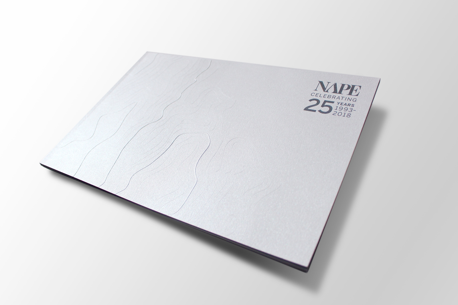
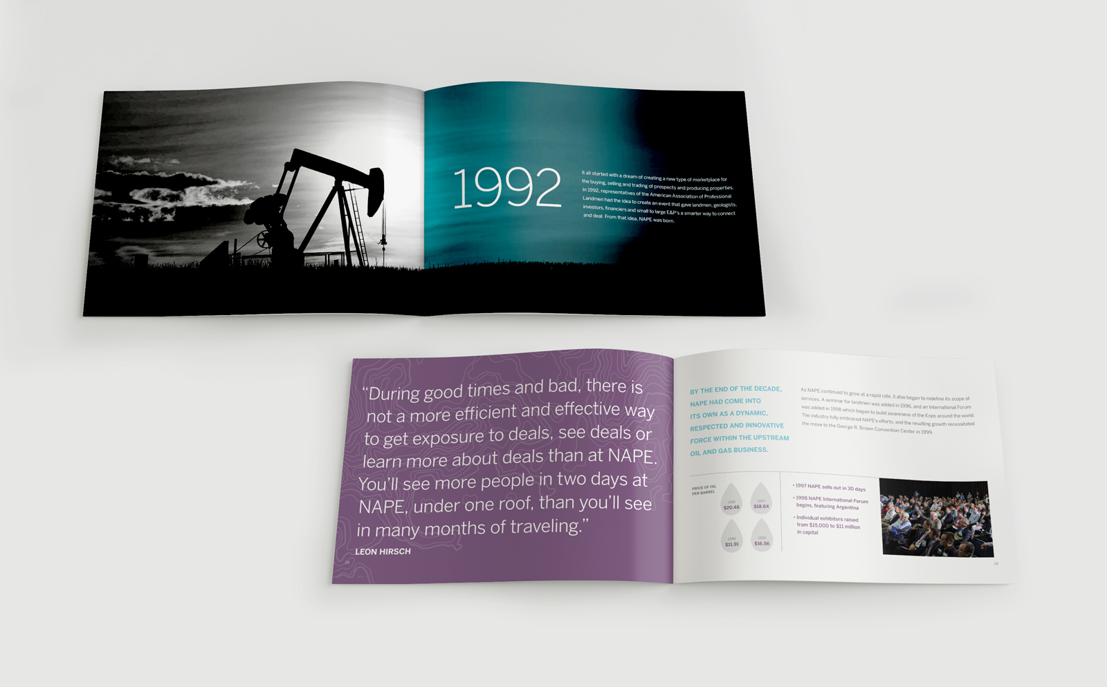
Since 1993, NAPE has organized the oil and gas industry’s largest gatherings of decision makers and investors. In that time, NAPE’s membership has grown twenty-fold, and their events have become the marketplace for prospects and producing properties.
To reinforce NAPE’s position as an influencer — and to engage a diverse audience that includes an expanding international presence — leadership sought a new brand image that would live up to the organization’s potential.
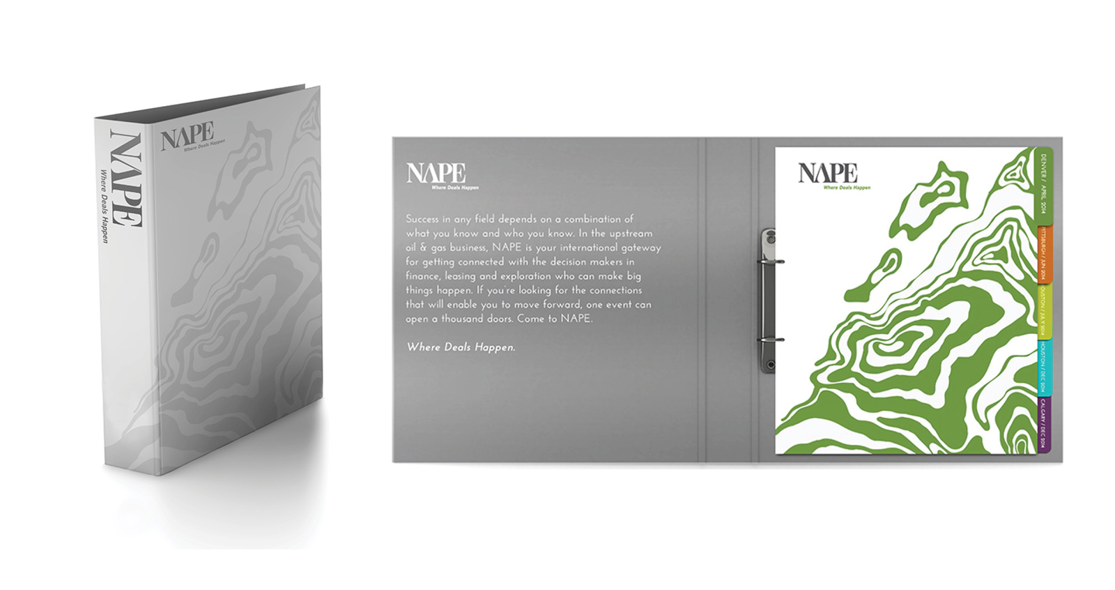
In our OnPurpose™ assessment, we worked to clarify NAPE’s value proposition. From there, we created a scalable story that worked at home and abroad. To make their events more scalable as they continue to grow, we also recommended a new naming convention for their Expos.
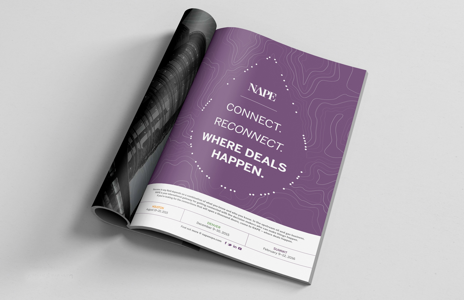
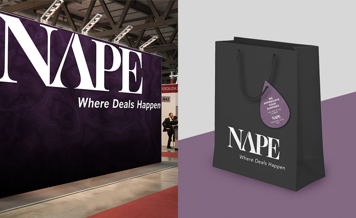
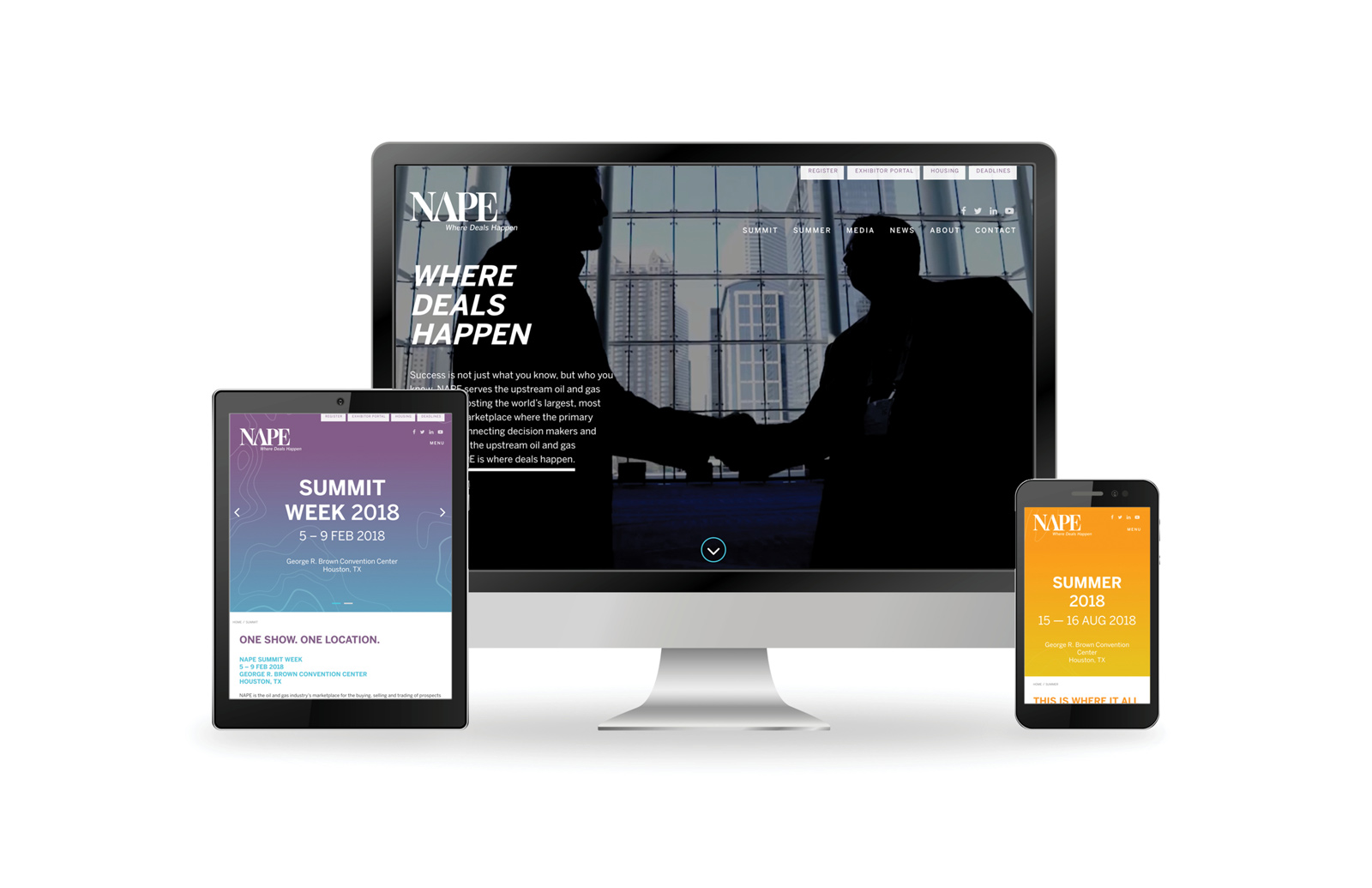
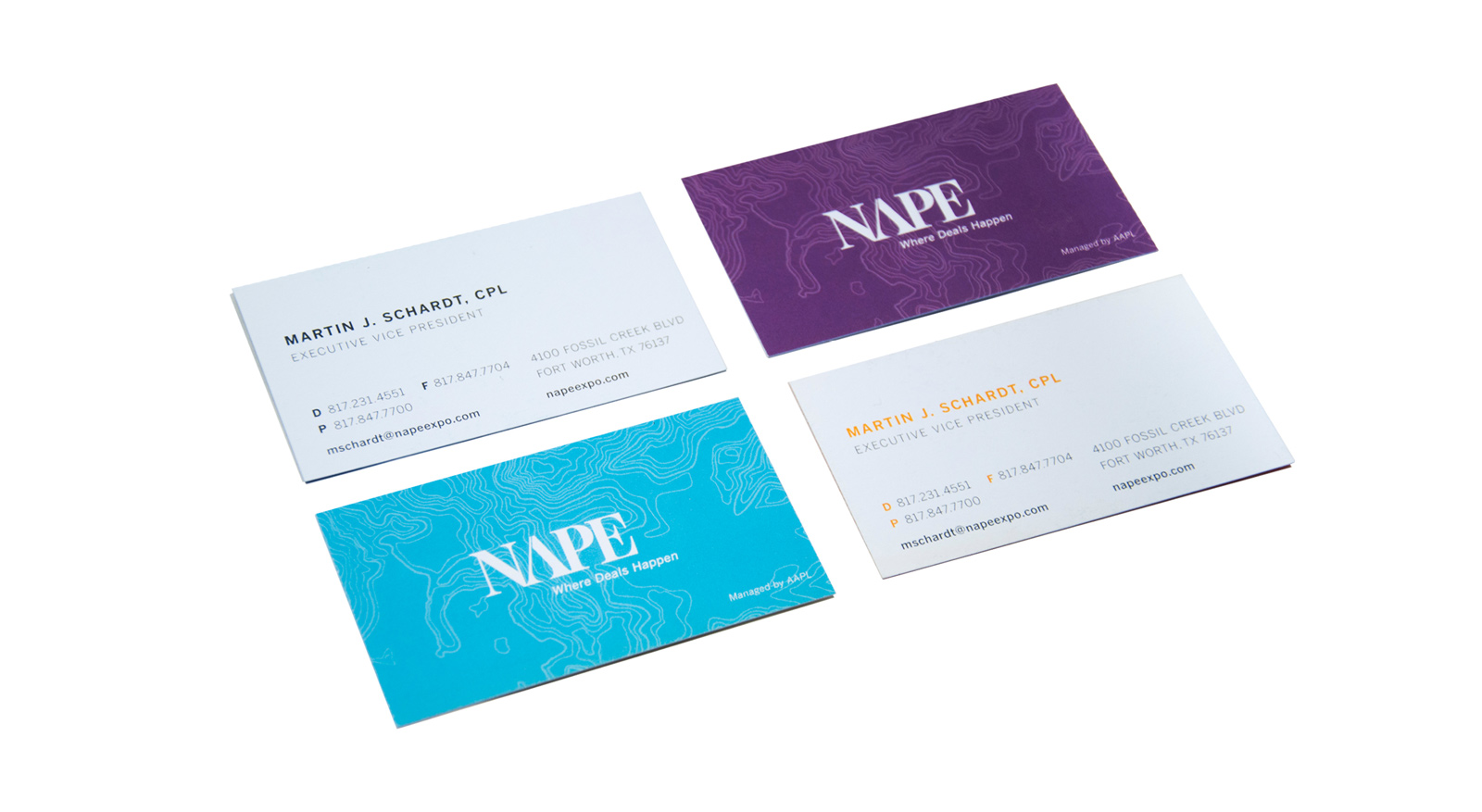
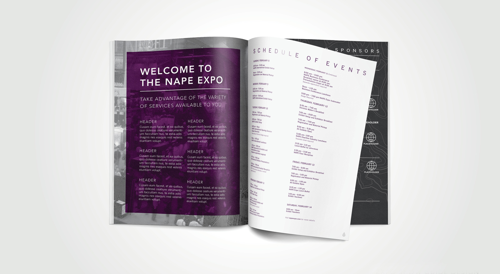
The visual identity — which includes a new logo, an intuitive website, and a complete event design program — looks past the clichéd “oil derrick” imagery. Instead, the NAPE brand shows up in bold, unexpected colors that set them apart.
The updated NAPE story begins and ends with a new tagline — Where Deals Happen—supported by confident messaging that positions NAPE as the leader it has truly become.
![]()